Hubway Data Visualization Challenge Entry: the flow of bikers
Last week, Hubway announced its Data Visualization Challenge. Hubway is a bike sharing system located in the Boston area: you simply pick up a bike at a particular station and drop it off at the closest station near your destination. For this challenge, Hubway released a CSV-file, containing over half a million rides. Each entry contains the origin and destination station as well as the timing-information and some anonymoused demographic information. The purpose of the challenge is to create appealing visualizations that provide Hubway with cool insights in how customers are using their bikes. As I had 8 hours to spare on a flight to New York, I decided to give it go.
1. Flow of bikers
The goal of my visualization is to depict how bikers flow through the city of Boston, namely: “taking a specific station as starting point, to which other stations are people biking”. A classical, graph-based visualization would show this flow, but would also be quite cluttered as each origin-destination tuple would have its own edge, this way failing to provide the grant overview. The use of a flow map however, would make the visualization both appealing and insightful. Cartographers use flow maps to show the movement of objects from one location to another, such as the number of people in a migration, the amount of goods being traded, or the number of packets in a network. Flow maps reduce visual clutter by merging edges where possible.
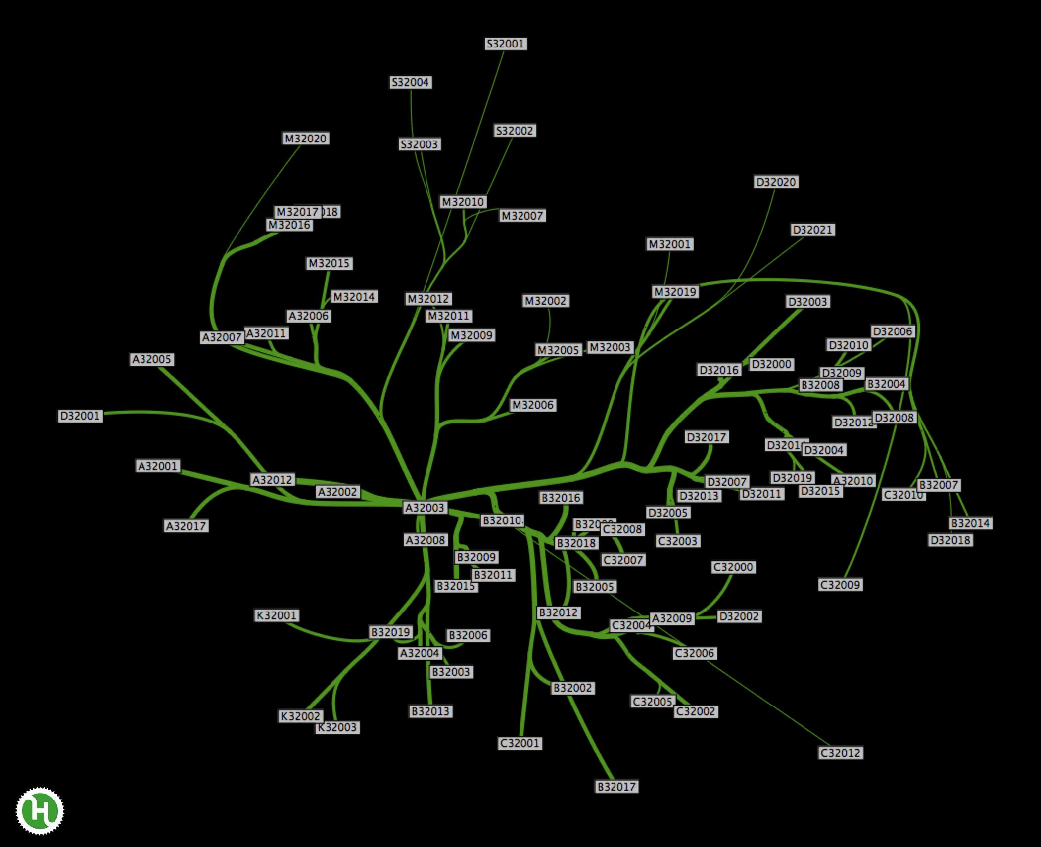
Playing around with the library in the past, I remembered somebody releasing a flow map layout implementation. Taking their implementation as a starting point, I applied some modifications (related to the mercator-layouting) and supplied it with my pre-processed Hubway biking data. For each station, I can now generate a separate map that visualises the flow of bikers towards other stations, where each station is mapped at its geographically correct location. As can be expected, most people bike to close-by stations, but others seem to enjoy their biking to far-off locations. Let’s have a look at a few examples. The image below displays the flow map for the Boston University Central station located at 725 Commonwealth Avenue (A32003). As this station is quite central to the city, we see that people bike off in almost all directions, although most of them keep close to Charles River.
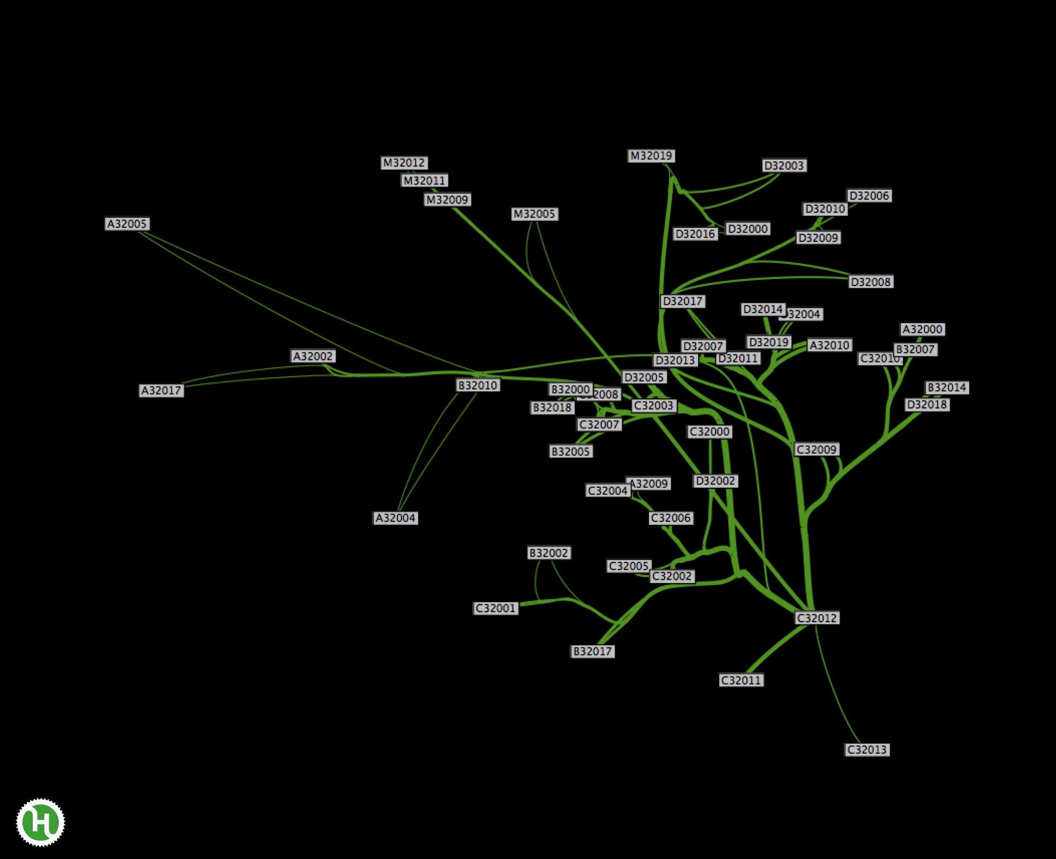
If we generate the flow map for a biking station near the corners of the city, such as Andrew Station on Dorchester Avenue (C32012), an entirely different flow pattern can be observed as biking destinations are concentrated at the east-side of Boston.
2. Conclusion
The current application could easily be extended to filter trips on demographics and/or timing information. One could also overlay various flow maps in order to detect similarities between flows of bikers. If people would be interested in extending my implementation, I willing to upload my “code-hacking” to github so that the project can be forked. Just let me know.