Yelp graph: checkin-based business clustering
Recently, Yelp made available a sample dataset from the greater Phoenix metropolitan area including around 11.000 business, 8000 checkin-sets, 43.000 users and 230.000 user reviews. With the help of this data, data scientists can execute real-life experiments with various data mining/machine learning algorithms. In our case, we are interested in finding out whether it is possible to visually cluster businesses by category, based purely on their checkin data. The checkin data itself is available on a day-hour level: for each business, it is possible to retrieve the number of checkins on a Sunday afternoon between 3 and 4. So, with only this data in mind, are we able to cluster businesses as being restaurants or fashion stores, based purely on the correlations calculated amongst their checkin data? For this experiment, we use the Neo4J graph database for storing our checkin-based correlation graph and employ the Gephi graph visualisation platform for interpreting the identified business communities/clusters. As always, the full source code of this article can be found on the Datablend public github repository (although you will need to acquire the dataset yourself through the Yelp Dataset Challenge portal).
1. Building the Neo4J checkin correlation graph
We start by parsing both the business and checkin json-files from the Yelp Dataset challenge. Unfortunately, checkin data is available for only 8,282 out of the 11,537 supplied businesses. In addition, many of these have only a limited set of associated checkins. Hence, in order to make sure that only relevant correlations are calculated, we ignore the ones that have less than a 100 checkins, resulting in around 1920 remaining businesses.
Next, we try to identify the correlation between two businesses by using the Pearson Correlation Coefficient (read this site for a nice introduction). Simply put, we try to identify whether a linear association exists between the checkins of two individual businesses. In our case, the calculation is based upon 168 data points (24 hours x 7 days), the idea being that two breakfast restaurants will get most of their checkins from the morning till noon, while two bars will get most of their checkins during the evening and at night. Hence, we expect the correlation between two businesses of the same type to be quite high, while different types of businesses (i.e. a breakfast restaurant and a bar) will result in little or no correlation.
Time to get our hands dirty. After parsing the data files, we use the existing apache.commons.math to calculate the pairwise correlation between the checkin datasets of the 1920 businesses. If the resulting coefficient is 0.8 or higher, we consider both businesses to be correlated. We create a unique node for each business within the Neo4J graph and combine them via a “correlated”-relationship.
The generated graph contains 606 unique nodes (i.e. businesses that are correlated to at least one other business) and 2585 edges (i.e. actual correlations).
2. Gephi interpretation
Our next task is to observe whether groups of businesses exists that are highly correlated (i.e. highly interconnected) and identify whether these correlations makes sense. In order to do so, we import our Neo4J correlation graph in Gephi through the Gephi Neo4J plugin. Once loaded, we run the modularity-function to identify meaningful communities. These computed communities are then used to partition (i.e. color) the nodes (and their related edges) so that clusters can easily be observed. Next, we apply K-core filtering, in our case 3-core, to keep the subgraph from which all nodes have a degree of at least 3 (i.e. 3 relationships with other nodes). The size of the nodes (and their associated labels) is configured to be proportional with their degree. Finally, we apply Fruchterman-Reingold lay-outing in order to clearly visualise the various clusters.
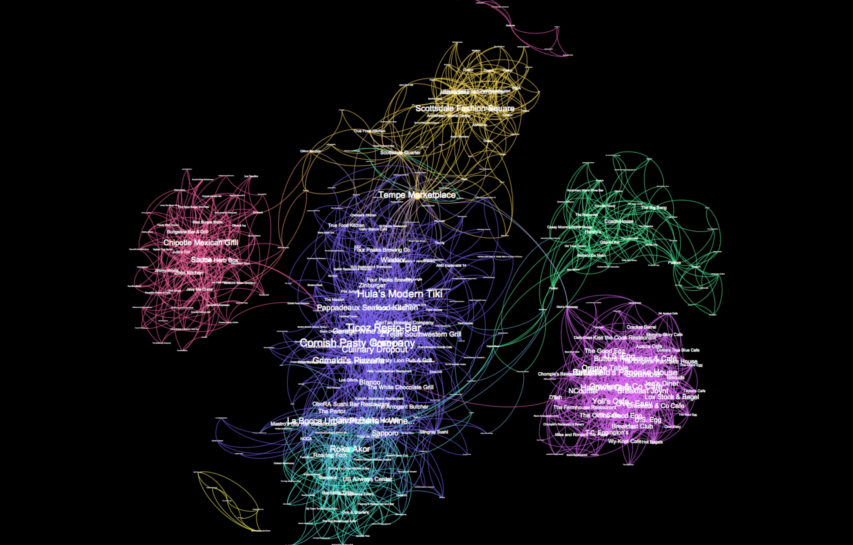
We can easily observe 8 communities, but are these clusters meaningful? The pink cluster on the right-end side is highly interconnected (i.e. all nodes of the cluster have mutual correlations). Most of them can be identified as being breakfast diners (ex. The good egg, The breakfast joynt and Orange table). Cool. This certainly make sense, as most of these business have checkins early morning until early afternoon. The yellow cluster on the top contains various department stores (including Costco, Nordstrom Rack and IKEA). Again meaningful, as most of them open their doors somewhere around 10AM and close around 7PM. At first sight, it seems strange that the coffee places are correlated into two separate groups (yellow cluster at the bottom and pink cluster on the top). The reason however is simple: some of them close late afternoon while others are open until midnight.
3. Conclusion
The Neo4J/Gephi solution works remarkably well to visually identify the various business clusters from the Yelp dataset. In a next blog article, we will show how to use the k-nearest neighbours algorithm to automatically predict the type of business based upon solely the checkin information.