Category visualisation
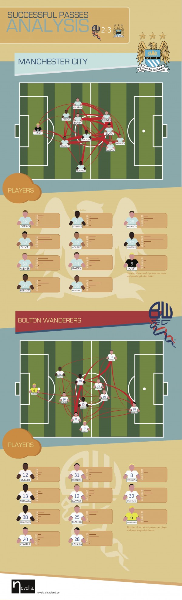
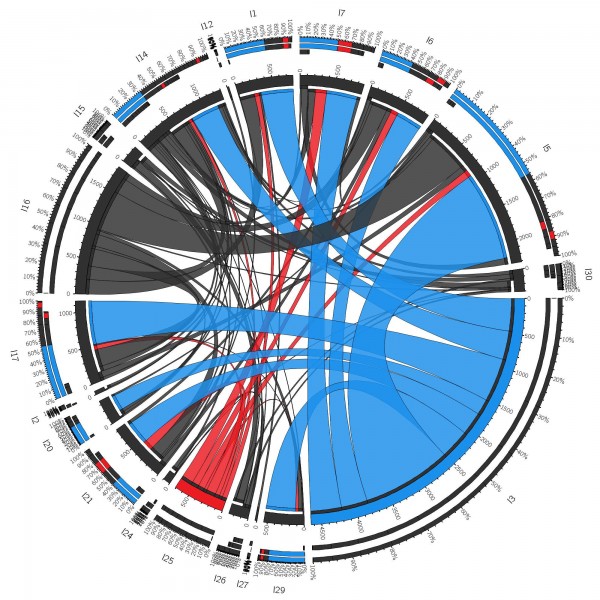
What makes Manchester City such a great team? The infographic below illustrates one of the teams most powerful characteristics: its successful passing capability. The visualisation is based upon the Opta dataset released in August 2011, containing the high detailed Bolton vs Manchester City match statistics. The data has been loaded in the neo4j graph databases
Wordt U ook overladen met informatie in verband met de komende verkiezingen? Bent U, net zoals zo vele andere burgers, op zoek naar een eenvoudig alternatief waarbij U in 1 oogopslag kunt zien waar elke partij voor staat? Zoek niet langer en maak gebruik van vk14-bingo.be. We hebben voor U de verschillende partijprogramma’s woord voor

Watch Davy Suvee present at GraphConnect London 2013 on the power of graph databases to analyse biological datasets. The Power of Graphs to Analyze Biological Data – Davy Suvee @ GraphConnect London 2013 from Neo Technology on Vimeo.
Recently, Yelp made available a sample dataset from the greater Phoenix metropolitan area including around 11.000 business, 8000 checkin-sets, 43.000 users and 230.000 user reviews. With the help of this data, data scientists can execute real-life experiments with various data mining/machine learning algorithms. In our case, we are interested in finding out whether it is possible
Last week, Hubway announced its Data Visualization Challenge. Hubway is a bike sharing system located in the Boston area: you simply pick up a bike at a particular station and drop it off at the closest station near your destination. For this challenge, Hubway released a CSV-file, containing over half a million rides. Each entry
Storing massive amounts of data in a NoSQL data store is just one side of the Big Data equation. Being able to visualize your data in such a way that you can easily gain deeper insights, is where things really start to get interesting. Lately, I’ve been exploring various options for visualizing (directed) graphs, including
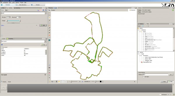
When I started running some years ago, I bought a Garmin Forerunner 405. It’s a nifty little device that tracks GPS coordinates while you are running. After a run, the device can be synchronized by uploading your data to the Garmin Connect website. Based upon the tracked time and GPS coordinates, the Garmin Connect website