Circle through your Google Analytics data with Neo4J and Circos
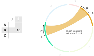
Storing massive amounts of data in a NoSQL data store is just one side of the Big Data equation. Being able to visualize your data in such a way that you can easily gain deeper insights, is where things really start to get interesting. Lately, I’ve been exploring various options for visualizing (directed) graphs, including Circos. Circos is an amazing software package that visualizes your data through a circular layout. Although it’s originally designed for displaying genomic data, it allows to create good-looking figures from data in any field. Just transform your data set into a tabular format and you are ready to go. The figure below illustrates the core concept behind Circos. The table’s columns and rows are represented by segments around the circle. Individual cells are shown as ribbons, which connect the corresponding row and column segments. The ribbons themselves are proportional in width to the value in the cell.
When visualizing a directed graph, nodes are displayed as segments on the circle and the size of the ribbons is proportional to the value of some property of the relationships. The proportional size of the segments and ribbons with respect to the full data set allows you to easily identify the key data points within your table. In my case, I want to better understand the flow of visitors to and within the datablend site and blog; where do visitors come from (direct, referral, search, …) and how do they navigate between pages. The rest of this article details how to 1) retrieve the raw visit information through the Google Analytics API, 2) persist this information as a graph in Neo4J and 3) query and preprocess this data for visualization through Circos. As always, the complete source code can be found on the Datablend public GitHub repository.
1. Retrieving your Google Analytics data
Let’s start by retrieving the raw Google Analytics data. The Google Analytics data API provides access to all dimensions and metrics that can be queried through the web application. In my case, I’m interested in retrieving the previous page path property for each page view. If a visitor enters through a page outside of the datablend website, the previous page path is marked as (entrance). Otherwise, it contains the internal path. We will use Google’s Java Data API to connect and retrieve this information. We are particularly interested in the pagePath, pageTitle, previousPagePath and medium dimensions, while our metric of choice is the number of pageViews. After setting the date range, the feed of entries that satisfy this criteria can be retrieved. For ease of use, we transform this data to a domain entity and filter/clean the data accordingly. If a visit originates from outside the datablend website, we store the specific medium (direct, referral, search, …) as previous path.
2. Storing navigational data as a directed graph in Neo4J
The set of site navigations can easily be stored as a directed graph in the the degree of my nodes is correct if I would perform other types of calculations. For each individual navigation relationship, we also store the date of visit.
3. Creating the Circos tabular data format
The Circos tabular data format is quite easy to construct. It’s basically a tab-delimited file with row and column headers. A cell is interpreted as a value that flows from the row entity to the column entity. We will use the Neo4J Cypher query language to retrieve the data of interest, namely all navigations that occurred within a certain time period. Doing so allows us to create historical visualizations of our navigations and observe how visit flow behaviors are changing over time.
Next, we create the tab delimited file itself. We iterate through all entries (i.e. navigations) that match our Cypher query and store them in a temporary list. Afterwards, we start building the two-dimensional array by normalizing (i.e. summing) the number of navigations between the source and target paths. At the end, we filter this occurrence matrix on the minimal number of required navigations. This ensures that we will only create segments for paths that are relevant in the total population. As a final step, we print the occurrences matrix as a tab-delimited file. For each path, we will use a shorthand as the Circos renderer seems to have problem with long string identifiers.
The text below is a sample of the output generated by the printCircosData method. It first prints the legend (matching shorthands with actual paths). Next it prints the tab-delimited Circos table.
4. Use the Circos power
Although Circos can be installed on your local computer, we will use its online version to create the visualization of our data. Upload your tab-delimited file and just wait a few seconds before enjoying the beautiful rendering of your site’s navigation information.
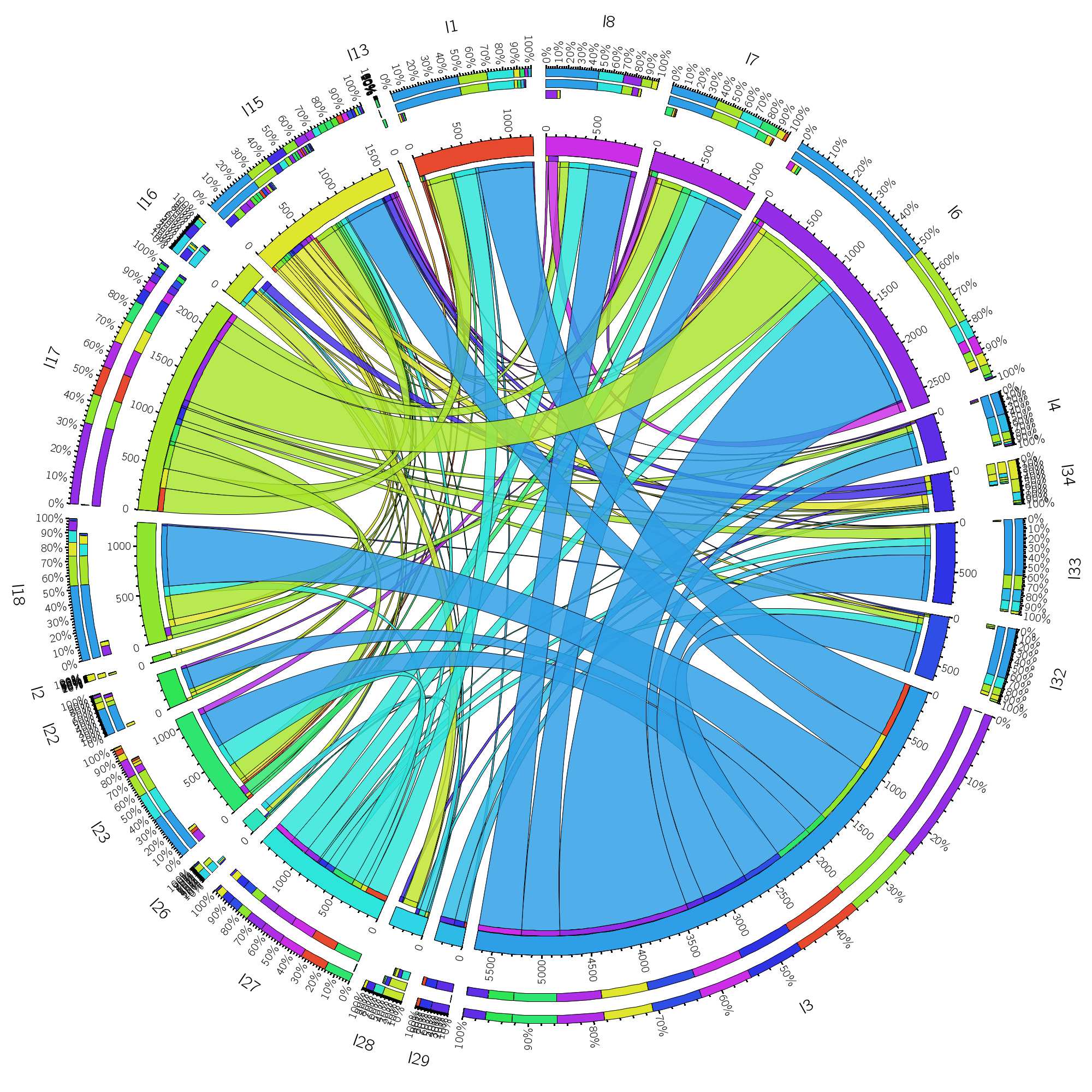
With just a glimpse of an eye we can already see that the l3-segment (i.e. the referrals) is significantly larger (almost 6000 navigations) compared to the others segments. The outer 3 rings visualize the total amounts of navigations that are leaving and entering this particular path. In case of referrals, no navigations have this path as target (indicated by the empty middle ring). Its total segment count (inner ring) is entirely build up out of navigations that have a referral as source. The l6-segment seems to be the path that attracts the most traffic (around 2500 navigations). This segment visualizes the navigation data related to my “The joy of algorithms and NoSQL: a MongoDB example”-article. Most of its traffic is received through referrals, while a decent amount is also generated through direct (l17-segment) and search (l27-segment) traffic. The l15-segment (my blog’s main page) is the only path that receives an almost equal amount of incoming and outgoing traffic.
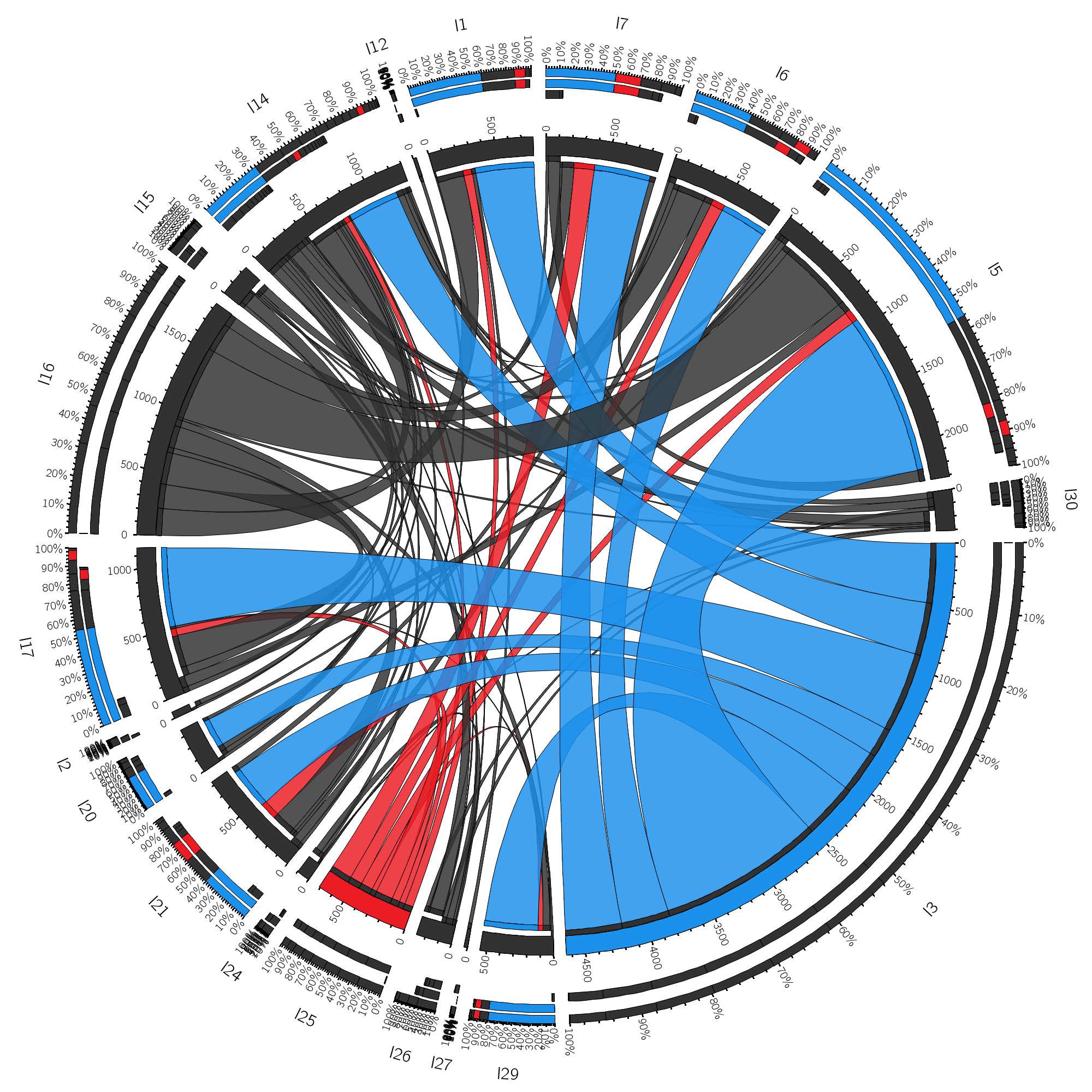
With just a few tweaks to the Circos input data, we can easily focus on particular types of navigation data. In the figure below, I made sure that referral and search navigations are visualized more prominently through the use of 2 separate colors.
5. Conclusions
In the era of Big Data, visualizations are becoming crucial as they enable us to mine our large data sets for certain patterns of interest. Circos specializes in a very specific type of visualization, but does its job extremely well. I would be delighted to hear about other types of visualizations for directed graphs.